In Touch Resources
Development of branding and visual language for a supplier of high quality and user friendly learning resources for Foundation Phase children. The strong visual language is carried through into the range of resources and supporting materials.
Category Archives: University Work
In Touch Resources
In Touch Resource Pack
Resource pack for schools, aimed at children aged 3-7 (Foundation Phase). The pack contains A3 laminated dry-wipe resource sheets, press-out self assembly dice, A4 photocopiable resource sheets, teacher guide, sticker pack and a pre-configured ipad containing interactive games.
In Touch ipad games
Sticker Pack and Teacher guide
Pop-up Display Panel
Critical Paper Book
The brief was to publish my Critical Paper as a printed book.
My critical Paper was entitled Psychology led Design – Investigating the Potential for Graphic (Communication) Design to Positively Facilitate a Better Learning Experience for Young Boys Through the Foundation Phase in Wales.
My research question was – By using some the finding of child psychologists and ideas from radical thinkers who have helped to shape the early years Foundation Phase we have in our Primary schools today, can I as a designer significantly improve the learning experiences of the rising number of young boys struggling to learn?
The finished book is 48 pages plus cover and was printed by Blurb. I took photographs of children in the Y1 class I help out in, centering on their hands doing things. I then digitally manipulated the images to create bright and colourful colours with which to base my colour palette.
Here are a few sample spreads.
D&AD Competition
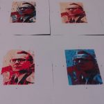
The brief was to choose from one of this year’s top five films, and create my own unique cover for Little White Lies magazine. I screen-printed my image of the main character, Smiley, this allowed me to produce multiple colour ways. The background image is taken from an imprint of a piece of soundproofing, featured a lot in the film. My approach was to create the feel of a cold war poster produced around the time the film was set.
RSA Student Design Awards
The RSA Student Design Award brief for 2011/12
To Inspire the nation with a set of Royal Mail Special Stamps
World with a Future
The brief was to design a set of stamps as a means of encouraging consumers to make positive environmental changes and educate future generations with regard to energy conservation, low-impact transport, zero-carbon housing, and reducing water over-consumption.
This set of stamps is aimed at families with young children. Families, including my own, consume large amounts of food, generate a lot of waste, grow out of and wash a lot of clothes. Not to mention all the ferrying the kids around! I wanted my stamps to appeal to children because they are the future. I have made them bright and colourful with a simple direct style which conveys the message clearly but in a child friendly way without alienating the adults!
In my second set of stamps I have tried to convey the message that the everyday objects that people throw away are beautiful, have a value, should be re-used and then recycled.
Alumni posters
I designed this set of two posters for a project entitled Alumni. The two posters were placed side by side in an exhibition at the University. They incorporate my six year old son’s hand-writing and feature the first and last word in the Oxford Essential English Dictionary (Children’s). The idea is that my son is at the beginning of a long journey of learning. He has just started to read write and spell. He is at the beginning just like the work aardvark. He will undoubtedly use this dictionary in the future as he progresses through his education. I have recorded his letter formation of the moment, and the colours I have used are from his favorite T-shirt of the moment, something personal to him.


