I worked with my partner to design a new identity for Rocketalk, the biggest social network operating in India. The branding was based around a calligraphic interpretation of the “R” which was a simple but distinctive shape, easy to apply in multiple situations and easy to use in grass roots guerrilla campaigns.
Tag Archives: design
Exhibition panels for Design for Ageing Well project
I worked with my partner to design these panels for the Design for Ageing Well research project.
The panels were cleverly produced by printing on to a strong but lightweight polyester fabric meaning that the client could easily roll them up and transport to academic conferences wherever in the world they needed to go.
The panels were suspended by hanging from lightweight alloy poles or thin shock cord threaded through reinforced eyelet holes, making this a truly flexible and transportable solution.
Promotional leaflets for Monmouthshire County Council
Final Major Project
In Touch Resources
In Touch Resource Pack
Resource pack for schools, aimed at children aged 3-7 (Foundation Phase). The pack contains A3 laminated dry-wipe resource sheets, press-out self assembly dice, A4 photocopiable resource sheets, teacher guide, sticker pack and a pre-configured ipad containing interactive games.
In Touch ipad games
Sticker Pack and Teacher guide
Pop-up Display Panel
Critical Paper Book
The brief was to publish my Critical Paper as a printed book.
My critical Paper was entitled Psychology led Design – Investigating the Potential for Graphic (Communication) Design to Positively Facilitate a Better Learning Experience for Young Boys Through the Foundation Phase in Wales.
My research question was – By using some the finding of child psychologists and ideas from radical thinkers who have helped to shape the early years Foundation Phase we have in our Primary schools today, can I as a designer significantly improve the learning experiences of the rising number of young boys struggling to learn?
The finished book is 48 pages plus cover and was printed by Blurb. I took photographs of children in the Y1 class I help out in, centering on their hands doing things. I then digitally manipulated the images to create bright and colourful colours with which to base my colour palette.
Here are a few sample spreads.
D&AD Competition
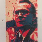
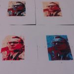
The brief was to choose from one of this year’s top five films, and create my own unique cover for Little White Lies magazine. I screen-printed my image of the main character, Smiley, this allowed me to produce multiple colour ways. The background image is taken from an imprint of a piece of soundproofing, featured a lot in the film. My approach was to create the feel of a cold war poster produced around the time the film was set.


